Given the ABC News article, “Heart Device”, I think the best graphic to go alongside a presentation would be a diagram. After some brainstorming, the diagram I would like to propose will have a headline of “Protect Her Heart”. To further centralize the idea of this graphic I would include a few sentences at the top of the graphic, the chatter.
In the chatter I could include data from the five ICD trials that tested
the ICDs in 3,810 men and 934 women. I would also write about the need for further testing of the ICD in females.
As far as illustration goes, the main illustration would be a large heart to the left side of the diagram. Inside that heart would be a small paragraph or some bullet points with facts about the “heart device” or ICD. On the right side of the graphic would be a male and female outline, something simple like what you might find on a bathroom sign should do fine. There would also be a heart on each body that the user could rollover for more specific statistics about the male v. female with heart issues, those who might need an ICD.
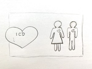
Adding some strong color to this graphic will make it look much cleaner and more appealing. The heart could be a deep red with white text over top. The rollover hearts could also be that same red. The bodies could be blue and pink to represent male and female, but I think a navy blue for both would make it look a little more sleek and professional.


Leave a Reply